
Material Innovation · Industrial · 2026
Brisil
Brand identity and 2026 guidelines for Brisil, a green silica company producing a lower-carbon, drop-in alternative to conventional silica from rice husk ash.
The brief
Where it started.
Brisil makes green silica, a sustainable form of silicon dioxide produced from agricultural waste. It is a high-performance, drop-in material used across tyres, footwear, oral care, paints and coatings. The existing logo carried real equity inside the industry, so we kept it untouched. The brief was everything around it: a system that lets a material-science company speak to procurement leads, sustainability officers and formulators in the same breath, without sounding like a startup or a commodity supplier.
Strategy & positioning
The thinking.
Keep the logo, build the system.
The original mark was working. Our job was to give it a world to live in, a palette, a type system and a layout grammar that frames Brisil as a serious materials company while signalling the agricultural origin of its product.
Palette as proof of source.
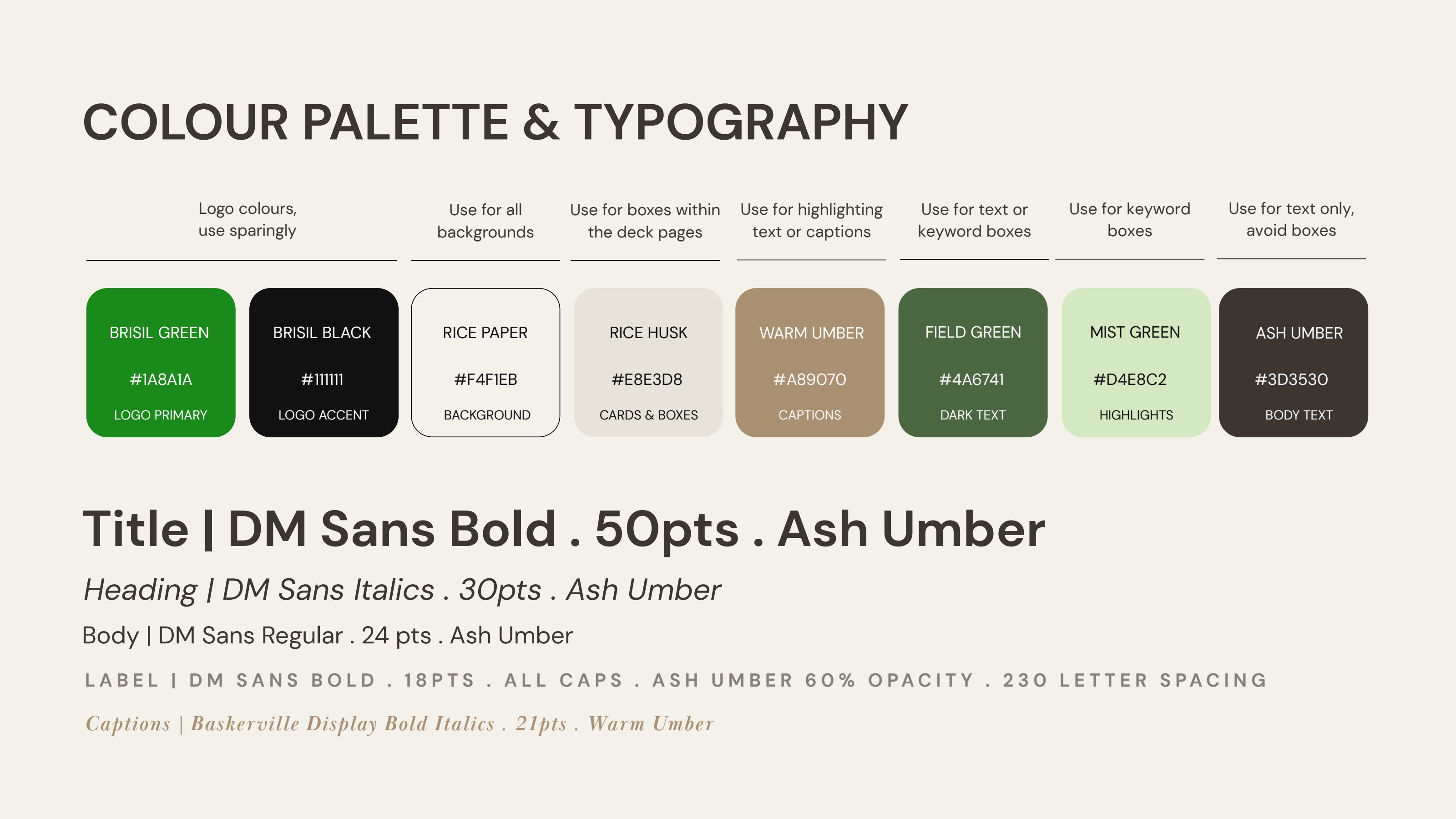
Rice Paper, Rice Husk, Field Green, Mist Green, Warm Umber, Ash Umber. Colours named after the material the company is built on. Every surface in the brand quietly references rice husk ash as the raw input, before a single line of copy is read.
Technical, not clinical.
DM Sans for everything structural, Baskerville Display italics for captions and proof points. The pairing keeps data sheets readable and gives sustainability claims a touch of editorial weight, so technical detail never reads as cold or generic.
Identity & visuals
How it looks.
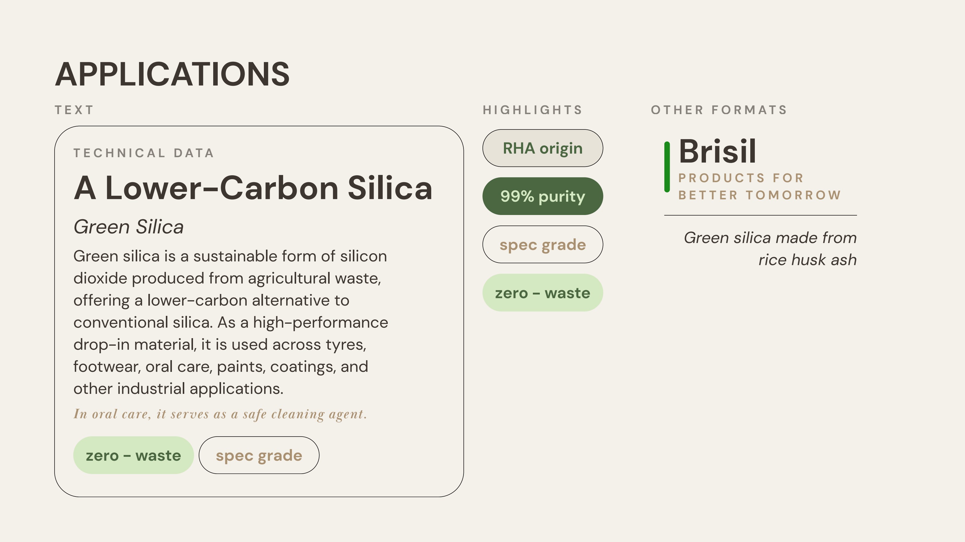
A 2026 guidelines system covering colour, typography, application cards, highlight pills, label specs and supporting layouts. Backgrounds default to Rice Paper, content sits inside Rice Husk cards, and Brisil Green is rationed as a logo and signalling colour so it never dilutes. Every component, from technical data blocks to keyword pills, was codified so the brand can scale across product sheets, decks and packaging without losing its register.
Outcome
One brand, three fibres,
one front door.
8
Colour tokens, each tied to source material
5
Typographic roles, codified for daily use
1
Guidelines document, ready for 2026 rollout
Start a project
Building something similar?
Start with a free 30-minute discovery call.