
Brisil · Green Silica
A system built around the logo we kept.
Brisil makes green silica from rice husk ash, a lower-carbon, drop-in alternative to conventional silica. The mark already carried equity inside the industry, so we built everything around it.
Context
Agricultural waste, industrial input.
Green silica is a high-performance form of silicon dioxide produced from agricultural waste, used across tyres, footwear, oral care, paints and coatings.
Brisil needed to speak to procurement leads, sustainability officers and formulators in the same breath, without sounding like a startup or a commodity supplier.
The existing logo was working, so the brief was everything around it.
The challenge
Sustainable claim, technical proof.
Green materials brands tend to over-index on nature cues, which reads as marketing to the engineers who actually specify the product.
The system had to hold laboratory precision and a credible sustainability story on the same page, using structure rather than imagery.
- Technical
- Drop-in
- Lower-carbon
- Specification-led
- Industrial
The idea
Keep the logo, build the world.
The mark stays untouched. Everything it sits inside becomes the brand.
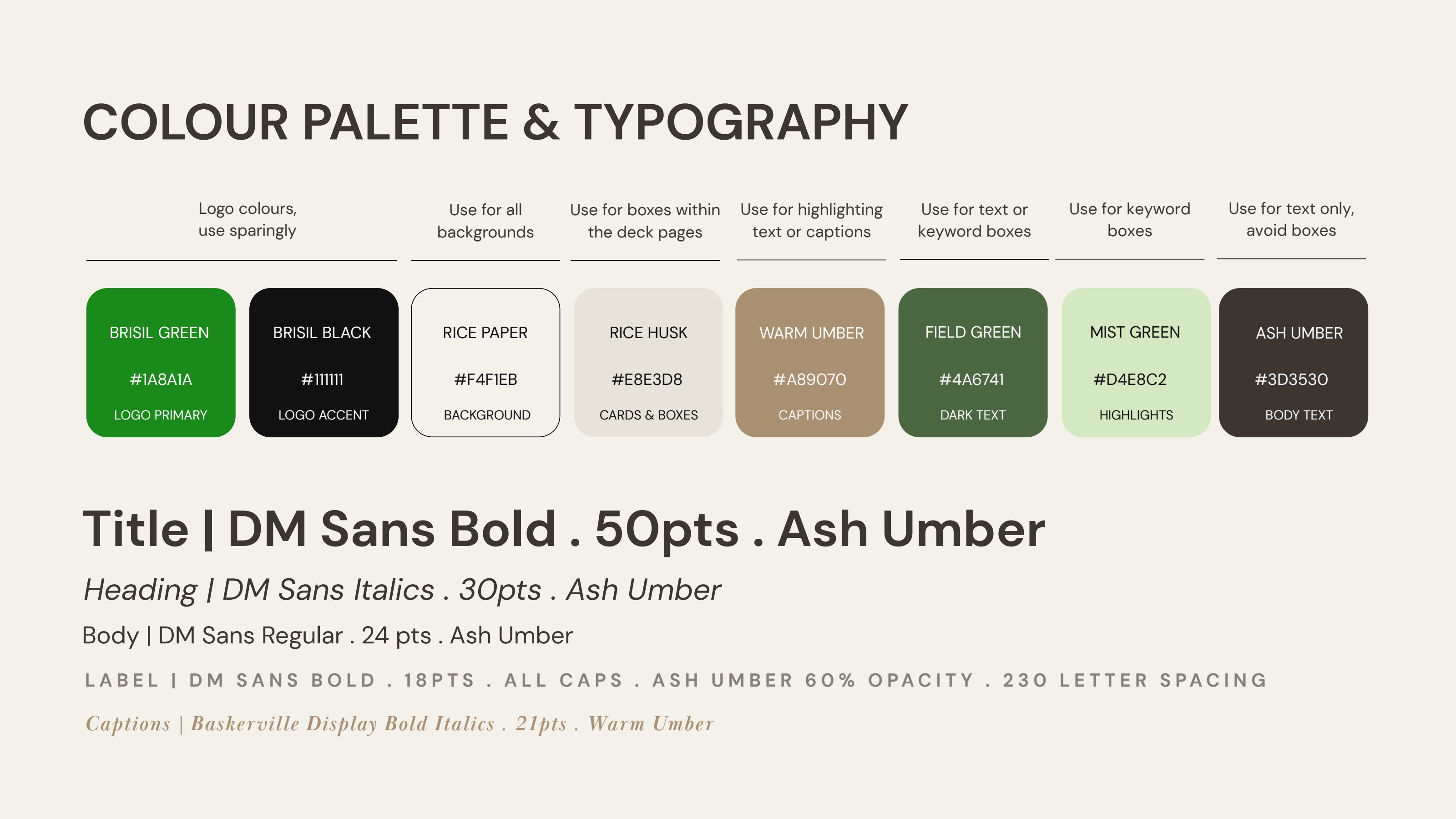
A palette, a type system and a layout grammar frame Brisil as a serious materials company while quietly referencing the agricultural origin of the product. Colours are named after the source: Rice Paper, Rice Husk, Field Green, Warm Umber, Ash Umber.
Logo design
A frame, not a redraw.
The original logo was preserved in full, with clear space, minimum sizes and reversed behaviour codified so it holds across data sheets, decks and packaging.
Brisil Green is rationed as a logo and signalling colour, never used as a background wash, so the mark always reads as the brightest point on the page.
- Clear space
- Minimum size
- Reversed use
- Signal colour
Colour system
Rice Paper carries every background, Rice Husk holds content cards, and the greens are reserved for logo and highlight. Ash Umber does the reading work so technical detail never turns cold.
Brisil Green
#1A8A1A
Field Green
#4A6741
Warm Umber
#A89070
Ash Umber
#3D3530
Rice Paper
#F4F1EB
Applications
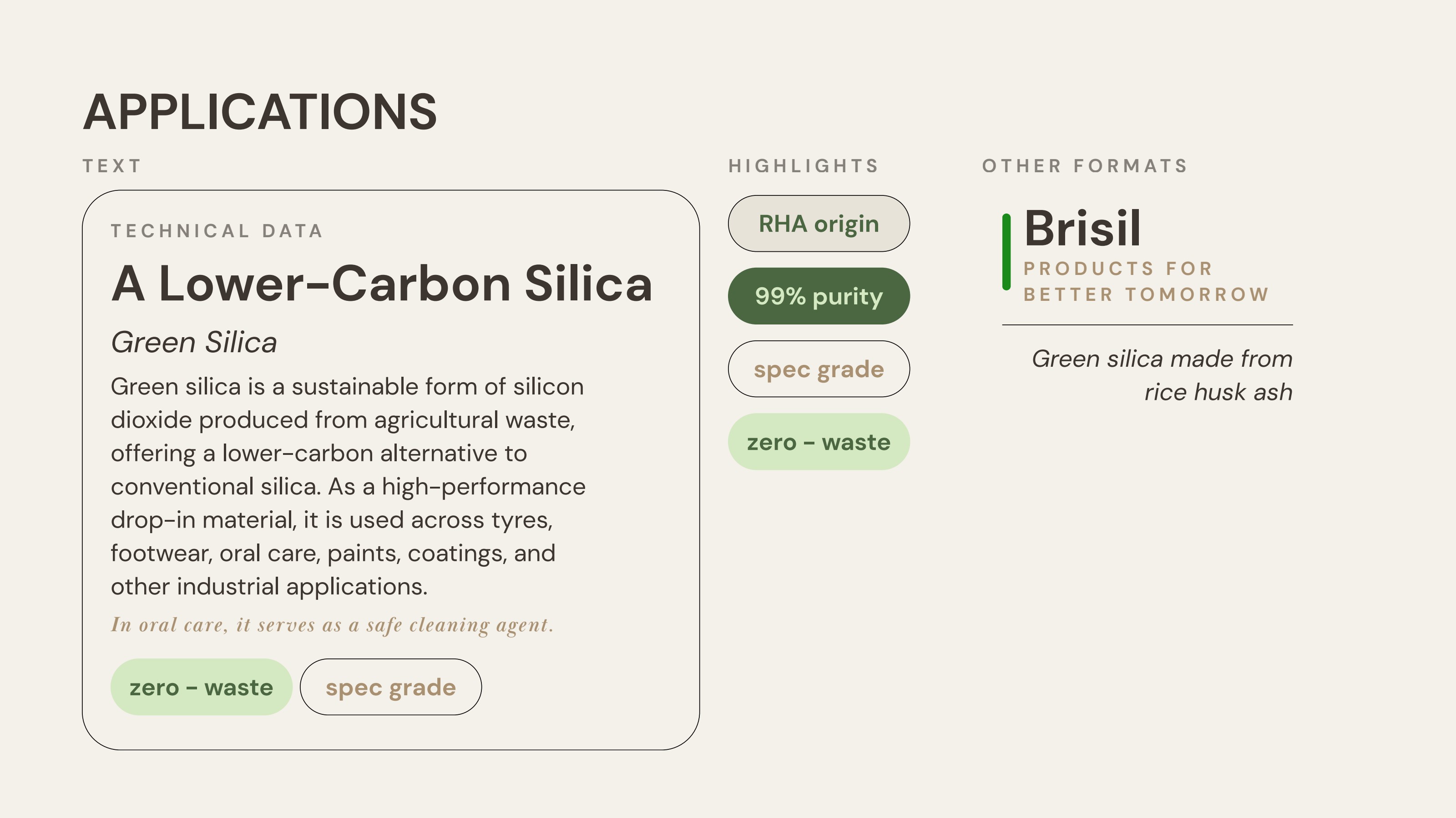
Technical data cards, highlight pills, label specifications, product sheets and decks, all built from one grid and one set of colour roles.
- Technical data cards01
- Product sheets02
- Label system03
- Decks & documents04
- Guidelines05
Outcome
A brand ready for 2026 rollout.
Brisil holds a full guidelines system covering colour, typography, application cards, highlight pills and label specs, so the brand scales across product sheets, decks and packaging without losing its register.
- 8
- Colour tokens, each tied to source material
- 5
- Typographic roles, codified for daily use
- 1
- Guidelines system, ready for rollout
Next case study
Peak Sustainability Ventures
A summit mark for India's deep-tech climate investment platform.
Read the case study →Start a project
Building something similar?
Start with a free 30-minute discovery call.
Brisil brand identity case study by Typiql.