
ChloroLabs · Sustainable materials & fibre technology
Engineering a brand for the future of natural fibres.
ChloroLabs is building India's vertically integrated hemp ecosystem, transforming natural fibres into scalable material innovation for global markets.

Context
Agriculture, industry, science.
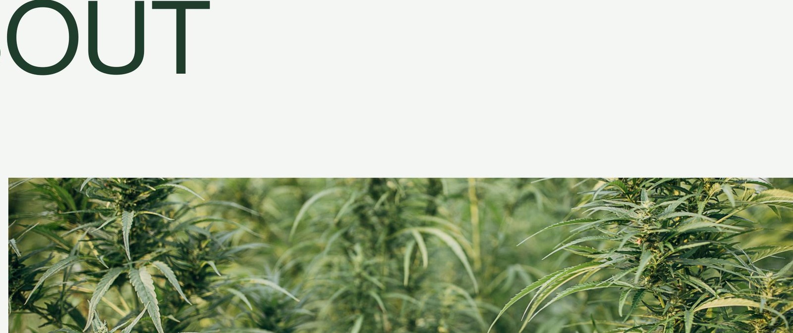
ChloroLabs operates at the intersection of agriculture, manufacturing, sustainability and material science.
The company develops high-performance natural fibres including hemp, flax and nettle, bringing together cultivation, processing and innovation under one brand.
The challenge was to create an identity that felt credible to manufacturers, investors and global partners while remaining rooted in its natural origins.
The challenge
Two clichés, neither true.
Most hemp brands fall into one of two categories: overly agricultural, or overly lifestyle-driven. Neither reflected ChloroLabs.
The brand needed to feel industrial, scientific, trustworthy, scalable and globally competitive, without losing its connection to the plant systems that power it.
- Industrial
- Scientific
- Trustworthy
- Scalable
- Globally competitive
The idea
From plant to performance.
The identity was built around transformation.
At its core, ChloroLabs takes raw biological material and engineers it into high-performance fibres. Every visual decision was designed to communicate this transition between nature and industry.
Logo design
A mark that is engineered, not decorated.
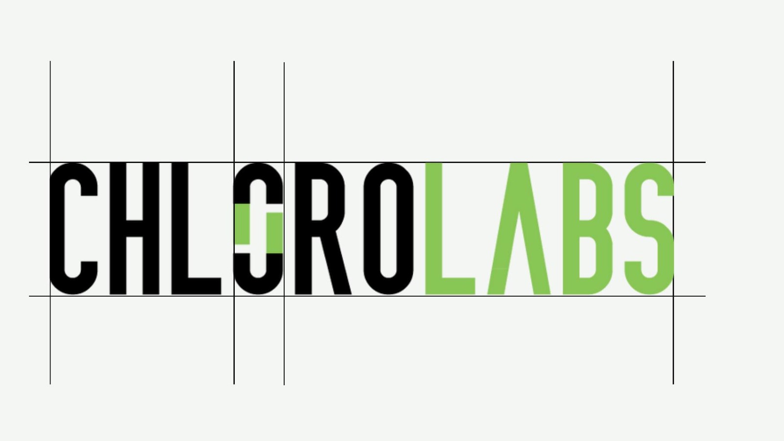
The wordmark uses a condensed industrial typeface to communicate efficiency, scale and technical expertise.
The defining feature is the custom broken "O". This interruption in the form becomes a metaphor for chlorophyll, processing, transformation and material innovation.
- Chlorophyll
- Processing
- Transformation
- Material innovation
One root, three fibres

ChloroHemp

ChloroFlax

ChloroNettle

Building a visual language
A shorthand for the whole system.
The submark isolates the broken "O" into a linked, engineered symbol. It carries the brand on its own wherever the full wordmark cannot go, and reads as clearly at 12mm on a hang tag as it does across a factory wall.

- Packaging01
- Documentation02
- Manufacturing assets03
- Digital touchpoints04
- Merchandise05
Typography
Swiss precision, contemporary voice.
A pairing rooted in Swiss precision and contemporary functionality. Together they create a voice that feels intelligent, established and future-focused.
Primary
Aa
Neue Haas Grotesk
ABCDEFGHIJKLMNOPQRSTUVWXYZ
abcdefghijklmnopqrstuvwxyz 1234567890
A neo-grotesque rooted in Swiss modernism, used for headlines and structural type. Clear, neutral, precise.
Secondary
Aa
Söhne
ABCDEFGHIJKLMNOPQRSTUVWXYZ
abcdefghijklmnopqrstuvwxyz 1234567890
Warmer and quietly modern, carrying subtitles, body copy and technical detail without competing with the primary.
Colour system
Industrial rigor, biological vitality.
Deep blacks and mineral neutrals establish trust and technical rigor, while chlorophyll green injects life, regeneration and fibre origin. Green is rationed as a signal, never used as a wash.
Chlorophyll Green
#8FD460
Deep Forest Green
#1F3D2B
Fibre Grey
#8A8F8C
Carbon Black
#0B0B0B
Mineral White
#F4F6F3
Applications
The identity at work.
Business cards, hang tags, stationery, technical documents, presentations and digital assets, all codified so the system holds together across a supply chain that spans farm, factory and export desk.
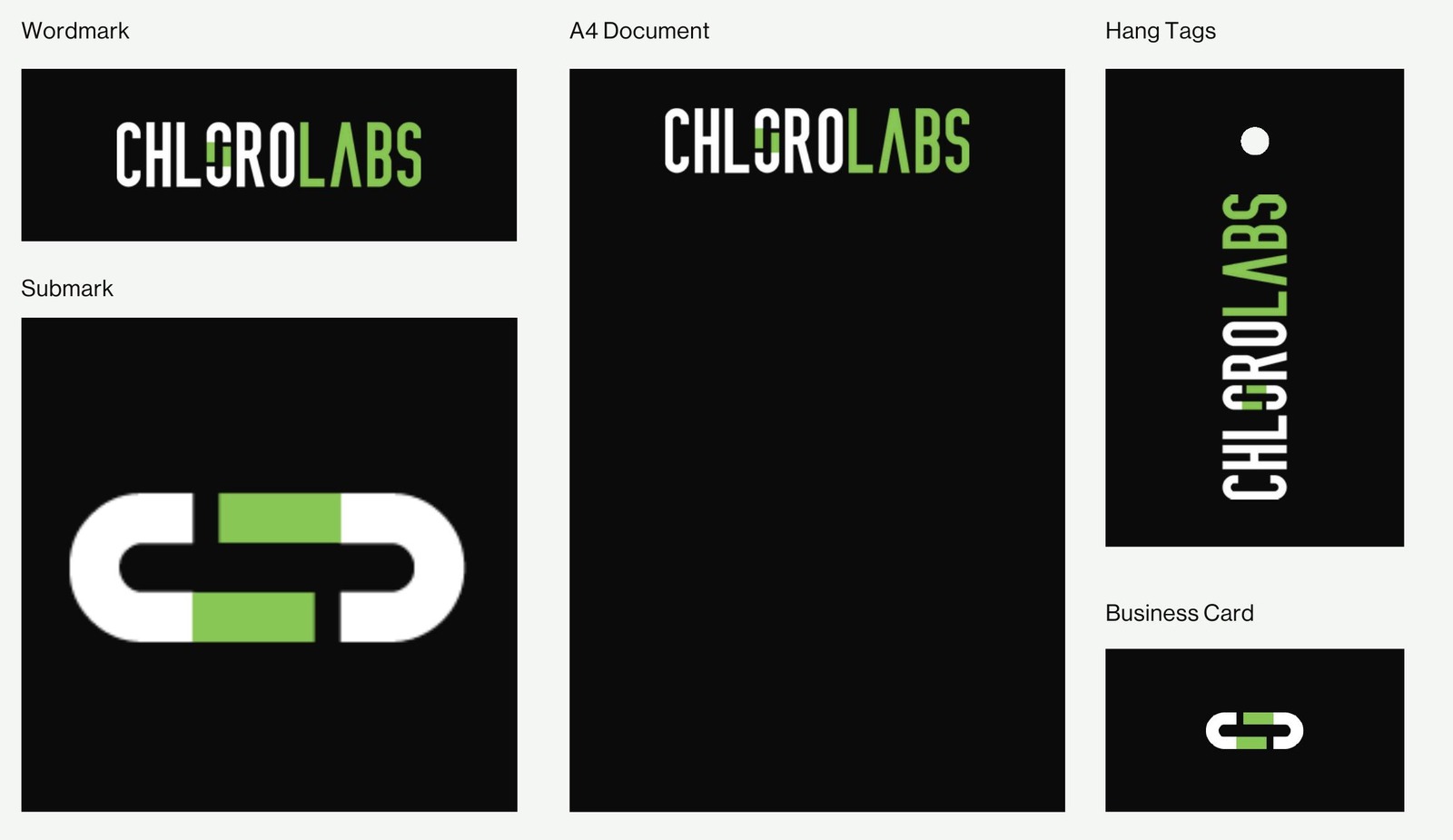
- Business cards
- Hang tags
- Stationery
- Technical documents
- Presentations
- Website assets
Outcome
A brand designed to scale.
The final identity positions ChloroLabs as a material innovation company rather than simply a hemp company. By balancing scientific credibility with natural intelligence, the brand establishes trust across manufacturing, research and global partnerships while remaining connected to its origins.
- 3
- Material families unified under one system
- 5
- Colour tokens, from chlorophyll to carbon
- 1
- Guidelines system, ready to scale globally
- Client
- ChloroLabs
- Industry
- Sustainable materials
- Services
- Brand identity, logo design, brand system
- Year
- 2026
Next case study
Brisil
Brand identity and 2026 guidelines for a lower-carbon green silica company.
Read the case study →Start a project
Building something similar?
Start with a free 30-minute discovery call.