
Niyama by Staymaster · Hospitality
A quiet discipline, kept as a house style.
Niyama is a signature villa inside the Staymaster portfolio. The identity had to feel like a private residence with a name, not another listing in a catalogue.
Context
A house, not a listing.
Staymaster curates experiential stays across India, with signature properties that carry their own names and their own guests.
Niyama sits at the top of that portfolio, so it needed an identity distinct enough to be desired on its own while still reading as part of the parent brand.
Niyama, from the Sanskrit for observance or discipline, gave the work its direction: restraint as luxury, ritual as hospitality.
The challenge
Villa branding without the cliché.
Premium stays default to script logotypes, palm silhouettes and gold on black. All of it reads as rented rather than owned.
The brand had to convey architectural quality and a slow, considered stay, and survive being applied by a hospitality team at speed, on signage, linen, menus and listings.
- Architectural
- Restrained
- Ritual
- Warm
- Ownable
The idea
Architecture as the monogram.
The mark is a doorway, drawn the way the house is drawn.
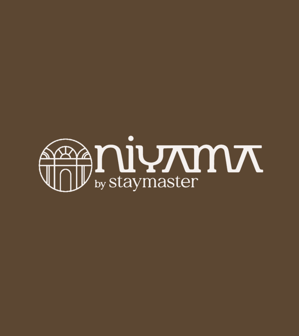
A circular emblem holds an arched façade in single-weight line: arch, columns, threshold. It is the first thing a guest sees on arrival and the last thing they touch on the way out, so it became the brand rather than a decorative crest.
Logo design
A logotype with an arched spine.
The wordmark takes the arch out of the emblem and into the letterforms: rounded shoulders, flattened apexes and a chamfered A that echoes the roofline.
The Staymaster endorsement sits beneath in a quiet serif, small enough to read as provenance rather than co-branding.
- Threshold
- Arch
- Observance
- Provenance
Colour system
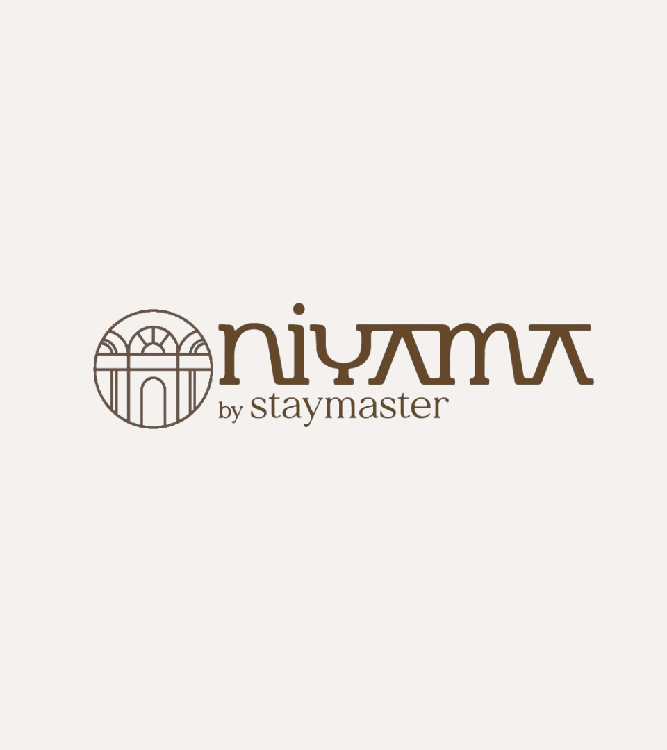
Two colours, used in both directions. Walnut carries the wood, stone and shade of the property; the cream is the light it is finished in. Reversing the pair gives the brand day and night registers without adding a third tone.
Walnut
#5C4732
Cocoa Line
#654828
Warm Stone
#E9E3E0
Lime Cream
#F5F1EF
Applications
Arrival signage, welcome cards, in-villa menus, linen and amenity marks, and the listing photography direction that carries the house across the Staymaster platform.
- Arrival signage01
- Welcome cards02
- In-villa menus03
- Amenity marks04
- Listing art direction05
Outcome
A stay that reads as a residence.
Niyama now has a mark that holds its own against independent boutique properties while remaining unmistakably part of the Staymaster portfolio.
- 2
- Colours, two directions, one system
- 1
- Emblem, drawn from the architecture
- 1
- House brand, endorsed by Staymaster
Next case study
Yebbow
A rebrand for a hand block-printed kidswear and twinning label.
Read the case study →Start a project
Building something similar?
Start with a free 30-minute discovery call.
Niyama by Staymaster brand identity case study by Typiql.