
Yebbow · Kidswear & Twinning
Childhood joy, not childishness.
Yebbow makes hand block-printed kidswear and twinning sets on 100% mul cotton. The rebrand had to carry the joy of the prints without defaulting to bubble type and primary colours.
Context
Beautiful product, quiet brand.
Founders Dimpy Mordani and Tanvi Seth had built a genuinely lovely catalogue: vivid hand block prints on soft mul cotton, made for children and for families dressing alike.
The brand around it did not carry that. It read as a small store rather than a label with a point of view.
The rebrand had to be playful enough for a six-year-old and considered enough for the parent actually buying.
The challenge
Every kidswear brand looks the same.
The category runs on rounded display type, rainbow palettes and cartoon mascots, which flattens every label into the same shelf.
Yebbow needed one ownable detail and a system disciplined enough to let the prints stay the loudest thing in the room.
- Playful
- Considered
- Handmade
- Soft
- Twinning-first
The idea
A wordmark with a wink.
The name already had the idea hidden inside it.
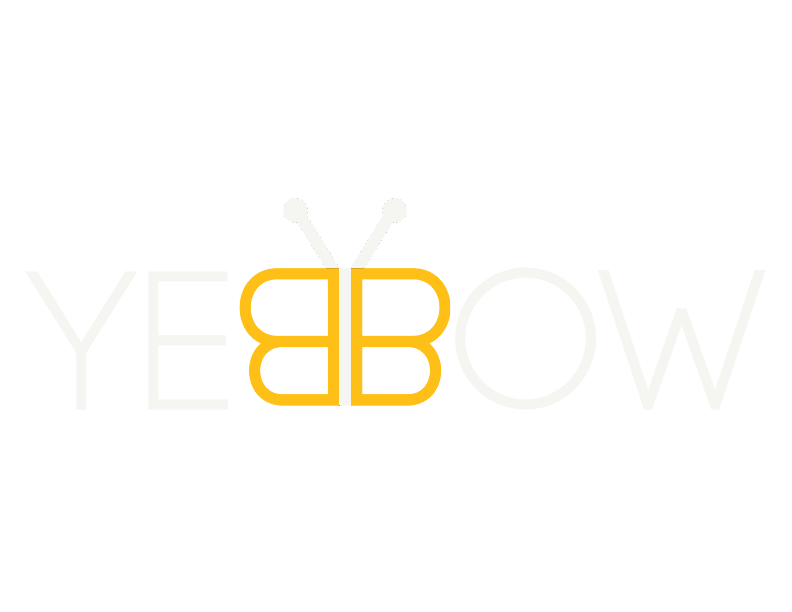
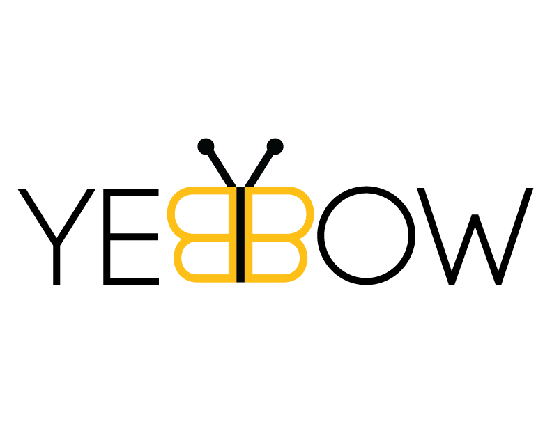
The double B was drawn as a bow, with two fine antennae lifting off the letterforms so it also reads as a butterfly. Children see the insect, adults see the bow. One detail, two readings, and a mark that scales from a swing tag to a storefront banner.
Logo design
Geometry, softened by hand.
The letterforms are geometric and monoline, so the mark holds up in embroidery, on woven labels and at thumbnail size on a marketplace listing.
The bow is the only place the yellow appears in the logotype, which keeps the brand colour working as a signal rather than a wash.
- Bow
- Butterfly
- Twinning
- Mul cotton
Colour system
A single warm yellow, pulled from the founders' description of childhood as sunlight, held against ink and a soft off-white so the block prints never compete with the brand.
Yebbow Yellow
#FEC016
Soft Gold
#FCE083
Print Ink
#141210
Mul Cream
#FFF9EC
Applications
Swing tags, woven labels, packaging, campaign art direction and a storefront system built around twinning as a first-class category.
- Swing tags01
- Woven labels02
- Packaging03
- Campaign art direction04
- Storefront system05
Outcome
A label with a point of view.
Yebbow now has one ownable detail, a disciplined palette and a system that treats twinning as a category rather than an add-on collection.
- 100%
- Mul cotton, kept as the product hero
- 2
- Readings held in one mark
- 1
- Rebrand across product, packaging and web
Next case study
Brisil
A brand system for a lower-carbon green silica company made from rice husk ash.
Read the case study →Start a project
Building something similar?
Start with a free 30-minute discovery call.
Yebbow brand identity case study by Typiql.